
Have you got the new version of LinkedIn yet? It seems to be rolling out on a fairly random basis. At a recent workshop I delivered, I didn’t have the new version but most of the attendees did. It is almost like LinkedIn are delaying moving some of the larger more complete profiles – perhaps they are having problems. 😀
Anyway, I have found an empty profile that I can use to show those of you that have it how to use the main parts of the new version. I suspect they are still making some changes so we won’t be covering it in too much detail.
The new simplified version of LinkedIn (designed to align with the mobile app) looks very much like Facebook. On the Home Page, your profile sits top right. The Newsfeed is in the middle below the entry box for status updates. On the right, there will be a new section called ‘What you need to know now’ (trending topics) – depending on what your contacts are doing or saying (I haven’t seen this on any home pages yet). Below this is an ad card.
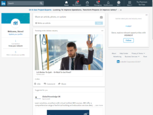
On the top, there are 8 areas on the menu bar.
- Search
- Home
- My Network
- Jobs
- Messaging
- Notifications
- Me
- More
Looking at each of these in turn (from a changes perspective):
Search
Search has been updated to one search box to cover people, jobs, companies, groups and schools (searching posts coming soon).
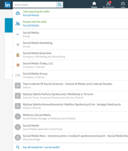
Choosing all results shows the specific types of search

Choosing one of these options shows the filters on the right-hand side of search (they were on the left before).
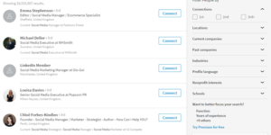
The search results don’t seem to be displayed in order of closest connection as they used to. According to LinkedIn, the ranking “is dependent on relevancy of ranking to the searcher”. This will include keywords, the searcher’s profile and attributes and the activity of the profiles returned.
Boolean search doesn’t seem to work as well as it used to – this seems to be moving to the paid version of Sales Navigator.
Home
There are a number of sections on the Home page:
- On the left-hand side of the Home page, you can
- Update your profile (see later)
- Grow your network (we don’t recommend entering your email address)
- See who has viewed your profile (much like before)
- See who has viewed your updates
- Share an article, photo or update.

Clicking on share an article, photo or update allows you to write a short update, mention somebody using @, or add a photo. You can now edit your post which is a big improvement!

The newsfeed has been tuned so you see content from publishers and people you care about. New ways to “dive into specific topics relevant to you and follow trending stories” will be rolling out.
Update your profile
This has generally been made easier to use. The main changes:
- The background photo is now 1536 x 768 pixels (narrower)
- The profile picture is circular
- Contact information (email, website, phone etc) is on the right-hand side of this section.
- Photo / Headline / Summary are all changed within the top section. Only the first two lines of your summary will be seen by default so these need to be carefully crafted.
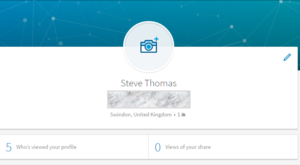
- Clicking Views of your share will show how many people have viewed your posts and updates. You can see more about who is reading and engaging with your content (company, job title, location)
- On the right-hand side, there are certain extra sections you can add to your profile. However certain sections like ‘Interests’, ‘Advice for Contacting’ and ‘Causes’ seem to have been removed as Sections for new profiles.
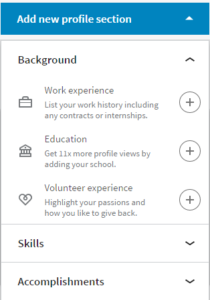
- It is not possible to reorder the sections in your profile.
- When you update your profile, changes don’t get sent to your network in general. No need to remember to change the setting! For specific sections, e.g. skills you have the option to change the setting for that section.
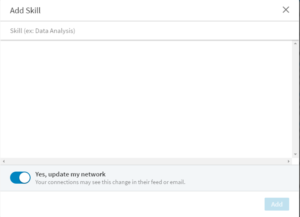
Highlights
When you look at someone’s profiles, you will see a new “Highlights” section just under the 2 line summary. This will show any mutual connections, companies you have both worked at, groups you are both members of or how they can help with an introduction into companies.
My Network
Will display all outstanding invitations, all your connections as well as people you may know. All tags (if you used them) have been removed and you can only sort by recently added, first name and last name.
Jobs
This hasn’t changed significantly at the moment
Messaging
Options to message connections will be seen throughout LinkedIn and LinkedIn will offer more suggestions to message based on what you are doing within LinkedIn. For example, if you are looking at a job opportunity, you will be told who in your network works in the company.
LinkedIn will also frequently suggest what you might want to say to somebody as a conversation opener.
Remember you will now see sponsored messages from companies (including LinkedIn).
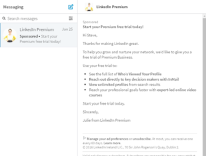
Notifications
Notifications will show what your contacts have been doing as well as who has viewed your profile as before.
Me
Another way of getting to your profile as well as viewing your privacy & settings.
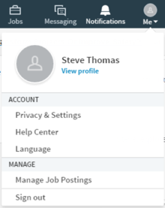
The privacy and settings section had already been changed. See our blog post about this.
More
The More section will change and develop depending on what you have access to on LinkedIn.
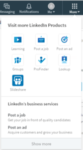
The More is where you will access your company profile (which also uses the new Cover page size). Changes to the company profile section will be covered in a separate blog post. We will also do a separate post for Profinder and Lookup which are new apps that are now in the UK.
Over to You
What do you think of the changes – if you have them? Do you like the new look or do you just hate change? Are there any features that you think are missing? We are just about to add a section to our latest LinkedIn e-learning course to cover this in more detail.
Would you like to get more out of LinkedIn? Why not explore our LinkedIn Online Course?

Mary, I got so used to it that I already forgot how the old one really looked like. However, I’m not sure if I’m a big fan of the fact that all these social media channels are adapting to each other and there is no difference anymore! LinkedIn used to be out of it all but now it’s got way too close to Facebook. Anyways, I still like LinkedIn very much 🙂
Thanks Mary for this informative post! I’m struggling to set up a new Company Page as the ‘Show more’ option you have at the end of ‘More’ does not appear on my MAC? Any tips or advice?
My drop down is in a different format and has:
LinkedIn’s business services:
Talent Solutions
Sales Solutions?