Before Christmas, LinkedIn released a new version of their app – which I have to say is going to make a real difference to my use of LinkedIn – as it mirrors the desktop version much more closely. The new LinkedIn app is split into 5 main sections:
![]()
Home
This is where you see updates from people in your network – it’s your ‘newsfeed’. You can like, comment or share updates, in the same way, you can with the desktop version.
![]()
Home is also where you write a status update (use Share at the top of the screen), add links or photos in the usual way. You can also mention other LinkedIn members using ‘@’

Choosing the photo icon (either when you have pressed Share or using the photo option on the top right of the screen) allows you to either select a photo that you have already taken, or allows you to take a photo in real-time – handy if you want to share what you are doing in real time.
Be aware that you can’t write a new LinkedIn published post using the app.
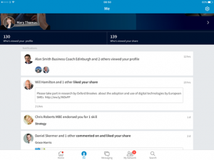
Me
This section has a number of purposes:

- Show a list of who has interacted with your posts (don’t forget to reply to comments) or viewed your profile (the main page)
- Show who has viewed your profile – remember, free accounts can see the last 5 people (click Who’s viewed your profile)
- Show your activity – what you have liked, shared, commented on and what you have shared and who has liked, commented, shared (click on who’s viewed your share)
- Show your published posts – (click on who’s viewed your share and then click posts). You can reshare these with your network or as a private message.
- Edit aspects of your profile (click on the > next to your name at the top). Click on the pencil to edit each section. If you scroll down on this section, you will also see who else people viewed (as well as your profile), which can pop up some interesting names. 🙂
- Click the Gear at the top right-hand corner to change your settings. If you sync your calendar, LinkedIn will give you information about the people you are about to meet.
Messaging
LinkedIn has improved their messaging service on the desktop and this improvement is also shown on the app. A list of individuals you have messaged or have messaged you is shown. Clicking on an individual shows you the full conversation and allows you to type a message (including a photo if required). Unlike the desktop version, you can’t include documents as attachments.
My Network
Display work anniversaries or birthdays from your connections. You can like, comment, say congrats or swipe to skip.
This section also displays a list of people you may know. If you click the Connect button, an automated invite will be sent. If you click on the individual’s name, it will display their profile. Clicking on the Connect button, will send the automated invite. If you click on the three dots on the top right, you can personalise your invite.
Search
This section allows you to search for people, jobs and more.
What’s Missing?
The obvious section that is missing is the ability to handle Company pages. Groups and Job Search are separate LinkedIn apps, but apart from that I’d say this is a vast improvement to using LinkedIn on a mobile device – what do you think?
